Elevate Your Packaging Design: Unveiling Specialty Inks for Unforgettable Impressions
When crafting the perfect packaging for your product, a multitude of factors demand meticulous attention. Among these crucial elements, none holds as much power as color. The strategic use of color can be your secret weapon to set your product apart. However, the realm of colors is vast, and the question lingers: how do you choose the right hues? Fear not, for there exists a realm of specialty inks, each with its unique charm, poised to elevate your packaging to extraordinary heights.
Glisten with Metallics
 When ordinary won’t suffice and brilliance is the goal, it’s time to summon the allure of metallics. These inks are no mere pigments; they house the gleam of reflective metal particles like copper and bronze. As these inks dry, they catch the light, casting a resplendent sheen upon the material. Silver and gold are the reigning champions in this arena, and rightfully so. They infuse an air of opulence and luxury, elevating your product to the echelons of sophistication. An added perk? Metallic inks can be a budget-friendly alternative to foil stamping, without compromising on the lavish finish. Step into uncharted design realms and unleash your artistic ingenuity with this ink of wonder.
Fluorescence: A Bold Declaration
Vibrancy and boldness beckon when fluorescence graces the stage. Often associated with highlighters, fluorescent inks possess an arresting palette of colors that refuse to go unnoticed. These inks derive their vibrancy from pigments that absorb ultraviolet energy, radiating it within the visible spectrum. To harness their full brilliance, it’s advised to print them on a black or white background. For an intensified impact, consider a double layer of this ink. Say goodbye to mundane shades; it’s time for the vibrant and the vivid to reign supreme.
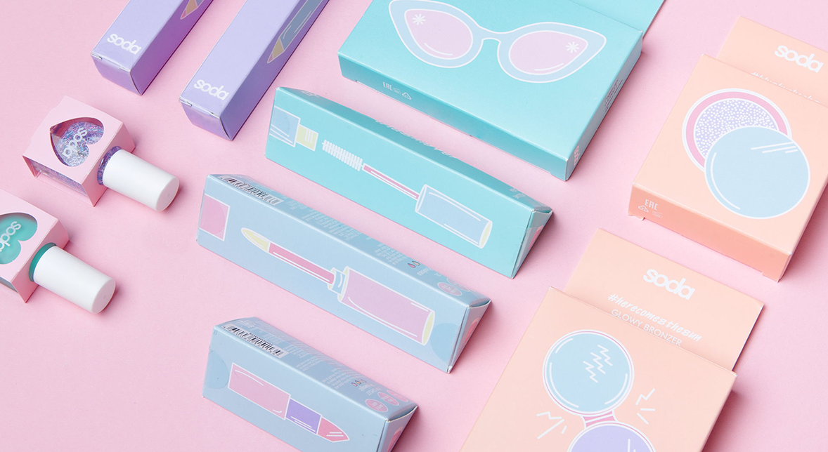
Softness and elegance with pastels

Sometimes simplicity can go a long way. Subtle and delicate colors can reflect a message of calmness and ease. Many companies are opting for this approach when designing their packaging. Pastel colors have made a resurgence with their softer tones such as baby blue, peach, and light mint. It might be slightly trickier to achieve these hues with the standard color palette, but more and more cosmetic brands are choosing this specialty ink option for their packaging. This now trendsetting pantone of colors has become the next fashionable thing, after glitter and unicorns!
No matter what path you take when it comes to choosing your ink, know that there’s a strategy that should be kept in mind. Different colors can make you feel different things as there is a psychology behind every hue (read more about the psychology of colors here). Therefore, choosing what fits best for your brand is crucial. Netpak’s team can help you narrow it down. With their variety of enhanced printing options, such as the metallic inks mentioned above, we are certified to help make your packaging simply ink-credible.
Netpak: Printed Folding Carton Experts. Contact us today for a quote: sales@netpak.com | CANADA – USA 1-866-399-8544