Unveiling the Influence of Pantone Color Institute in Packaging Design
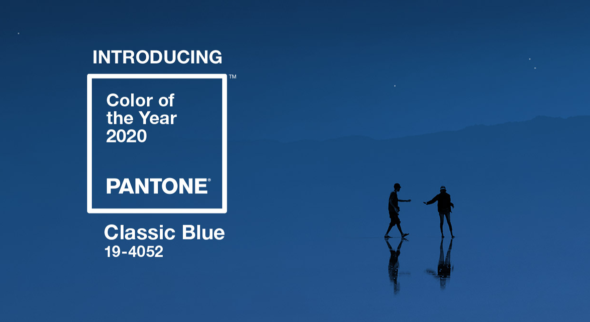
For over two decades, the Pantone Color Institute has wielded a significant impact on product development across diverse design domains, including graphic and packaging design. A yearly tradition unfolds as Pantone unveils the Color of the Year, a hue that not only embodies the essence of the upcoming year but also serves as a harbinger of global color trends.
And behold, for the year 2020, Pantone bestowed upon us a shade that resonates deeply with our identity: Pantone Classic Blue #19-4052. This color alignment seems almost fated, wouldn’t you agree? Our affection for this hue permeates every facet of our branding.
The Essence of Blue Unveiled
Colors, in their spectrum of shades, have an uncanny ability to evoke emotions and psychological associations. The palette you choose isn’t merely a visual decision; it’s a strategic one that shapes your brand’s perception. Dive deeper into the world of colors and their meanings here.
Blue, a hue entrenched in significance, signifies trustworthiness, honesty, and integrity. Beyond our personal predilection for blue, which shines vibrantly in Netpak’s branding, the color exudes resilience and reliability, often enveloping consumers in a cocoon of tranquility and serenity.
Blue as a Packaging Dynamo
The chromatic hues embraced in your packaging can single-handedly distinguish your product amidst the myriad choices on the shelf. Packaging design is a canvas where colors transmit messages. Blue, particularly, conveys a sense of honesty and credibility that today’s discerning consumers gravitate towards. It’s a shade that resonates powerfully across graphic design applications. In the Food and Beverage industry, the blue palette frequently aligns with products espousing health and sustainability – a burgeoning trend that resonates with the eco-conscious populace.
In a cutthroat market, where packaging design emerges as a potent marketing tool, the emotional resonance of colors, including our cherished blue, holds immense importance. Our squad of adept prepress and graphic connoisseurs stands ready to guide you in selecting the perfect hues for your branded packaging. Let us help you craft an arresting presence on the shelves, ensuring your product radiates the desired message while standing distinctly apart.
Remember, when colors speak, consumers listen. In this symphony of hues, blue orchestrates a message of trust, quality, and serenity. Let us paint your success story with the shades of brilliance.
For over 20 years, the Pantone Color Institute has been a strong influence in product development in all areas of design, including graphic and packaging design. Every year, Pantone announces a color that will represent the new year, forecasting global color trends.
Pantone announced the Color of the Year for 2020 – it just so happens to be right up our alley: Pantone Classic Blue #19-4052… We love this color! Can you tell by our branding?
The true meaning behind blue
As all colors generally evoke emotions and psychological insinuations, the palettes you choose from can be vital in boosting your brand’s image. Read more about colors and what they represent here.
Blue is color that is known as being trustworthy, while representing honesty, trust and integrity. Far beyond our love for blue, which Netpak uses strongly in their branding, the color fosters resilience and trustworthiness, often bringing a sense of peace and calmness to consumers.
Blue in packaging
The colors used in your packaging can help set your product apart from others on the shelf by boasting appealing aesthetics. In packaging design, blue represents an honesty and a credibility that today’s consumers are connecting to, making it the ideal shade for many applications in graphic design. In the Food and Beverage industry, the color blue is often related to products promoting good health and sustainability, an ever-growing trend.
When designing packaging in today’s competitive market, it is important to keep in mind the feelings each color represents, including our favorite hue: blue! Our team of prepress and graphic experts can help you select the right colors for your branded packaging and give you the advice you need to ensure your product stands out and portrays the message you desire.
Netpak: Printed Folding Carton Experts. Contact us today for a quote: sales@netpak.com | CANADA – USA 1-866-399-8544